Saturday, 28 September 2013

A foolish Samurai Wielding A Magic Sword.

I'm really enjoying Illustrator as a creative tool, so I thought I'd try and work in a different look, I had a go at creating another picture based of one of my favourite shows. Samurai Jack was a series on cartoon network running from 2001 to 2004 and in my opinion is a fantastic piece of narrative storytelling. I also love the unique look of the show. Designed by the very talented Genndy Tartakovsky.
I had fun making this image and I love the interesting use of tones and lines and I'd love to do more with this style and see if I can get it moving.

I didn't want to work in this style without trying something slightly more original with it so I thought I'd try and apply some the design ideas I picked up to a self portrait. I'm not 100% happy with it but there are a lot of elements I like about it so it's interesting thinking about what I can do to improve it.

Friday, 27 September 2013

Motion graphic experiments.

I felt like playing with some of the tools in photoshop and after effects so I found a couple of tutorials and set about playing around with Tweens in photoshop and 3D extrusion in after effects. the first is a flash screen designed for iPad formats, however I'm yet to figure out how to utilise this in a piece of software. But I like the results so I thought I'd post them.


The second is a test with an adjusted version of the same logo in after effects to see if I could achieve something new by combining the resources from the previous tutorial with another on extruding vectors in after effects, the results were interesting and I'd love to try out some plug ins on this but for now I'll leave it as it is as I have a couple of other things I want to try out before I throw myself into 3D.


Thursday, 19 September 2013

Run Cycle


I was playing around with the bone tool and I ended up making a run cycle with it, it's very rough but it illustrates how to use pre-cut graphics to make a character pretty well so I decided to post it as it maybe useful to someone explaining the principle, I've made all the graphics semi transparent so you can see all of the components at any given time.

Thursday, 12 September 2013

Friendship is magic.

I decided I'd take the time out to do a character piece and make something for a friend at the same time, Thanks to some reference from Inkwell pony via deviant art I designed a Custom pony for someone I used to work with, I had a lot of fun playing around with the colours and getting the layers right. I hope to come back to this and get it animated in future. overall this took me about 2-3 hours from start to finish.

Good For Health, Bad for education.

I was getting frustrated trying to colour more complex images in Illustrator so I decided to just throw all my frustration in to a 10 minute ad pieced based off a Graphic from the film and manga series Akira. Working in block colours gave it a nice Bauhaus/ Art Deco Vibe. It reminded me of the more recent Transport For London posters so I threw in a municipal authority reference. I also like the weird asymmetrical layout and how it all sort of landed when the "For"s lined up in the pill.

Monday, 9 September 2013

Classic restoration

I found a tutorial I was working through last year and decided it was worth playing around with and putting up, I'll try and post some colour versions in time, but for now here are some images of where I am so far. 


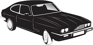
This was an inking an lining tutorial I found in Computer Arts Magazine involving a VW camper but I decided to put my own spin on it and work with a ford capri. I liked the basic lining and the blacked out version below.


It does need some work, but it was a fun little exercise and i'm getting a better and better grasp of Illustrator as I go. on another note here's a screenshot of something else I'm currently working on in flash. 
So far it's just a rough test based off some old bar doodles but i think it's worth cleaning up and showing off, I can't wait to get it done.